
Do read my previous post on Knowing Your Undertone before reading this.
Colour theory in short is color mixing and the visual impacts of color combinations. An artist/designers should understand the basics of colour theory in order to know how colors work with each other, and how one colour will influence another by placing it next to each other or even how the color will result in when you mix them together.
Sir Isaac Newton is the founder of Colour Wheel. He then split the sunlight into red, orange, yellow, green, blue, indigo and violet which is what we now known as the rainbow. He then joined the two ends of the colour together and it show a natural progression of colours.

There are many different kinds of colour wheel in the market and the one I'm showing you (down below) is the most basic colour wheel you can find online.

Primary colours are the ONLY three colors that cannot be mixed or formed by any combination of other colors. All other colours are derived from these three colours.
Primary Colours: Red, Yellow, Blue

Secondary colours is by combining two of the primary colours.
Secondary Colours: Green, Violet, Orange
Yellow + Blue = Green
Blue + Red = Violet
Red + Yellow = Orange

Tertiary Colours: One primary colour combine with one adjacent secondary colour.
Yellow + Orange = Yellow-Orange
Red + Orange = Red-Orange
Red + Violet = Red-Violet
Yellow + Green = Yellow-Green
Blue + Green = Blue-Green
Blue + Violet = Blue-Violet

Now we all know these are the colours spectrum from the colour wheel and we too learned about Warm and Cool undertone in the previous post. Do you know there are warm and cool colours in colour wheel too?
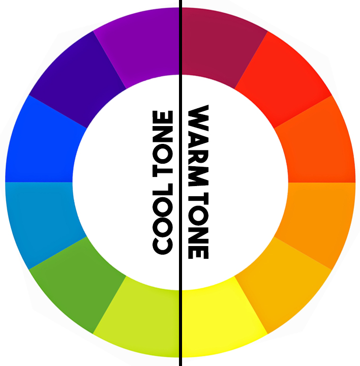
Warm Colours: Red-Violet, Red, Red-Orange, Orange, Yellow-Orange, Yellow,
Cool Colours: Violet, Blue-Violet, Blue, Blue-Green, Green, Yellow-Green
The color wheel can be divided into warm and cool colours. By understanding the differences of warm and cool colors, it will help you better in foundation/concealer colour matching if you are a makeup artist.
Warm colours are over whelming, vivid, bold and popping colours.

Cool colours are calm, soothing, laid-back and cold.

Any colours can be of warm and cool tone. For example, if a red lipstick that has a blue base, it's a cool red. If it has an orange base, it's a warm red. Whichever colour that has more of a blue, they will always be a cool tone colour and whichever colour that has more of a yellow is a warm tone colour.

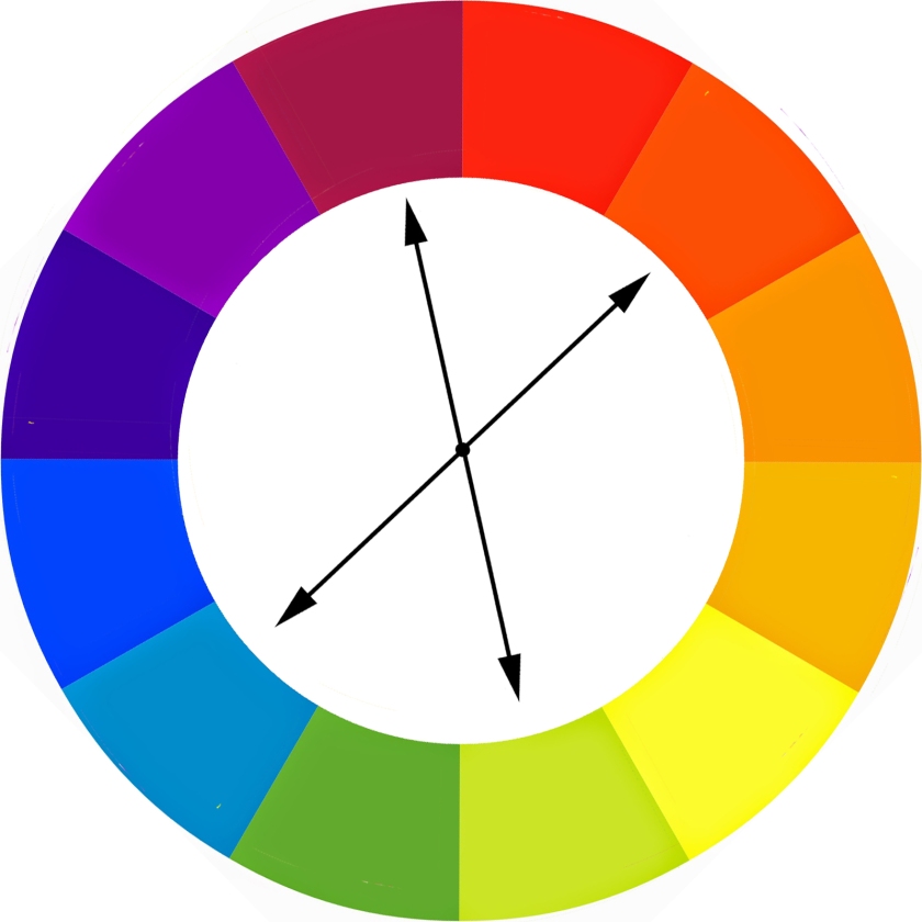
Ever heard of Complementary Colours?
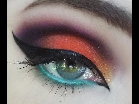
Colours that are opposite of each other on a colour wheel is known as complementary colours. They bring each other out making a visual contrast, thus both colours appear stronger against each other.


If you have a blue eyes, using yellow based gold eyeshadows will make it stand out even more.

If you have green eyes, purple eyeshadows will be your best friend. It will complement your eyes and bring the attention to it.

Complementary colours is not only useful in choosing the right shades of shadows, it also helps to counter act against the colour you do not want to see it on your skin. It is known as Colour Correcting in make up artistry. As opposite colours helps to bring out a strong visual contrast it too helps to cancel each other out.
For example, green concealer works best to cover up blemishes. Orange concealer works best to cover the dark circles. Purple concealer is able to cancel out any yellow undertone and that will makes you look brighter.

Monochromatic color schemes are made up of different tones, shades and tints within one colour.
Tints: Adding white to a colour
Tones: Adding gray to a colour
Shades: Adding black to a colour

Ingot Cosmetics is using the method of monochromatic system to sell their eyeshadows.
Analogous colours uses colours that are adjacent to each other on the color wheel. One color is used as a dominant color while the other two are used to enrich the scheme. The analogous scheme is similar to the monochromatic, but offers more nuances.

Triadic Colour is another type of colour scheme. It uses three colours equally spaced around the color wheel. To put it simply, draw a triangle in the middle of the wheel and use the colours that the three points of the triangle land on.
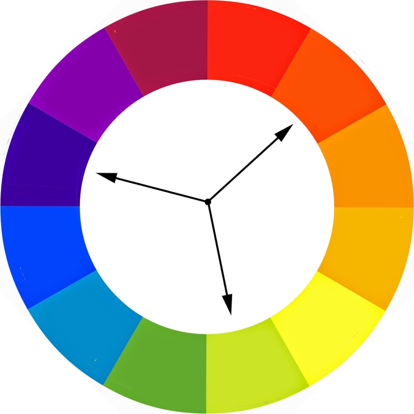
The triadic scheme is not as contrasting as the complementary scheme, but it looks more balanced and harmonious.
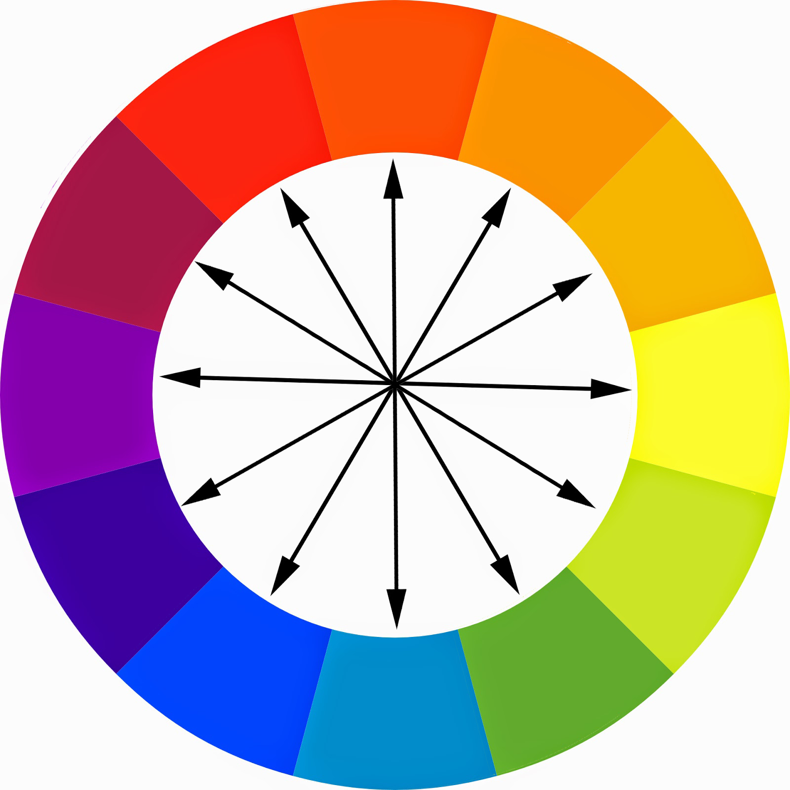
Last but not least, Tetradic colour. It sound complicated but it's just two sets of complementary colours. It works the same as triadic colour instead of a triangle, you should draw a rectangle instead. The only way to use this scheme is to choose one dominant colour and subdue the other three.
Do understand that Color Theory analyzes only the relationships of colors; it does not take color lightness and saturation into account.
I too suggest you to check out Adobe Kuler. They are like your online colour wheel however it's still handy to own a physical colour wheel in your kit.

Do you know that if you spin your colour wheel fast enough it will appears white? Because all the colours of the rainbow make up visible light.
No comments:
Post a Comment