Showing posts with label Eyeshadow. Show all posts

Sunday, 5 June 2016

Zoeva Cosmetics: Nude Spectrum Palette

Sephora 20% Sales going on hence I can't miss out and so I bought Zoeva...It's a beauty. NO, I DO NOT FEEL GUILTY for spending.
Zoeva Cosmetics launched their "Spectrum Collection" which consist of eyeshadow and blush palettes on 11th January 2016 (I silently prayed and wish for a sales and it did). This particular palette that I bought, Nude Spectrum is derived from the beauty of the desert, mesmerizing Earth toned and subtle sandy shades with iridescent hues waft shimmering effects on lids just like a mirage in the Sahara desert.
zoeva
It cost S$59 ($38USD) but with 20% it's only S$47.20. Truth? Their original price is consider cheap as compare to palette such as Urban Decay Naked Palette which cost S$83 with only 10 shadows.
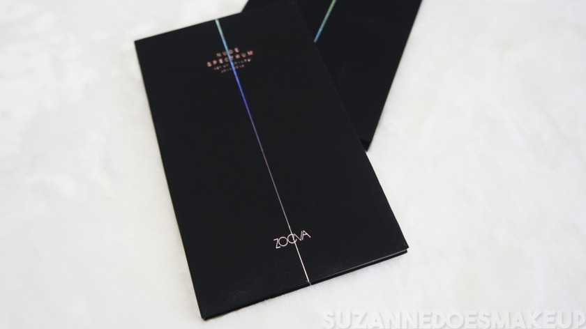
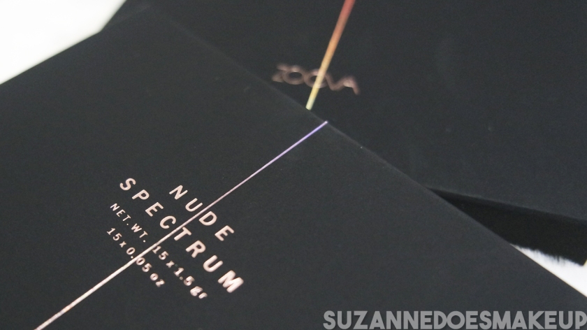
I do LOVE their packaging. It is a thin black matte cardboard palette. The material that they used which is a matte finishing surface with minimal rose gold letterings and holographic designs on it gave it a classy feel. I do know many doesn't really care much about their packaging design but I do...I just can't kick my designer habit away. I have a sweaty palm hence it will look grubby after use. It appears that the design is to be opened more like a book.
zoeva 4
Oh, they are manufactured with no parabens, mineral oils, fragrances and phthalates. Best of all, they are animal cruelty FREE! I am trying to use products that is cruelty free for years now. It's a struggle.
zoeva 1
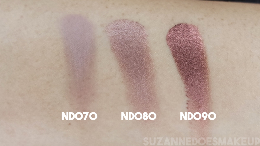
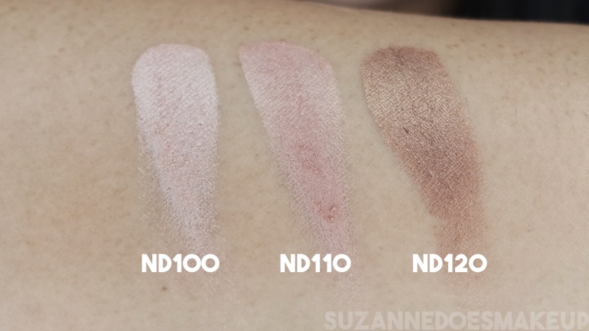
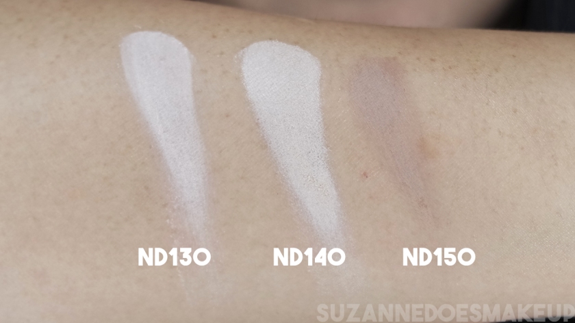
It comes in 15 shades and each pan cost only S$3.93(o.o5oz). There's a mix of matte, metallic and satin shades in every eyeshadow palette. Don't worry, I'm going to collect them all, one at a time.
zoeva 2
I chose specifically Nude Palette because it's suitable for everyday wear be it morning or night, very classy brown nude shades. However I wish they should have switch the black with an even darker brown or muddy brown colour because there's black in almost every palettes that I own and I find that not much people using it. There isn't a mirror or a brush with the palette. The names of each shade is printed in a small letter above pan.
zoeva 3
It took me a week to finally to dip into the palette. I just can't bear to destroy it. Swatches are swipe without primer and it's from top right to bottom left (photo as above).
NS 1
NS 2NS 3NS 4NS 5
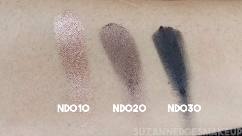
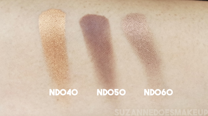
I was surprise when I first touch it. It indeed is very velvety smooth, soft and seamless. They are extremely pigmented and it glides on like a butter.
ND030 is the only shadows where it's patchy. ND130 and ND140 looks really similar. It will be better if they have a wider colour variation. I too hope they do have names for each shades instead of numbers, because one of the blush palette in Spectrum Collection shares the same numbers as this nude spectrum eyeshadow palette. Other than that I have not much of a complain.
Zoeva Cosmetics Full Face
Brushes is able to pick up the product really easily and they blend well. Downside of having such pigmentation shades is that they have bits of fallout but it's not as much as Lorac's.
Zoeva Cosmetics Eyes Only
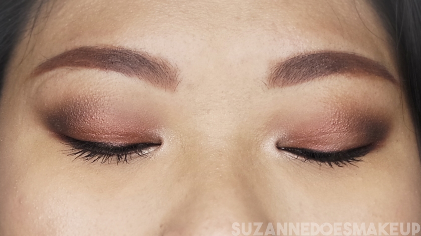
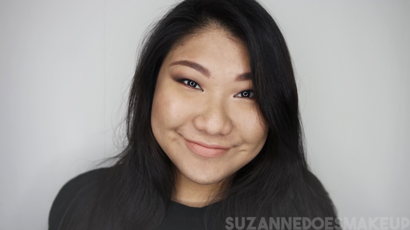
I used ND150 and ND050 on my crease and ND090 on the main lid. Shadows applied really easily without any effort at all. I forgot to mention that ND100 is used on inner corner.

PS: There will be video(s) coming up in Mid June because I have already schedule the rest of my videos. The video will be about this look.

Get it here: https://www.zoeva-shop.de/en/spectrum-nude-eyeshadow-palette/a-9008749/
Or here: http://www.sephora.sg/products/zoeva-nude-spectrum-eyeshadow-palette
Or here: http://www.beautybay.com/cosmetics/zoeva/nudespectrumeyeshadowpalette/

Original Post: https://suzanneworld.wordpress.com/2016/05/20/zoeva-cosmetics-…spectrum-palette/

What's my Colourpop Super Shock Shadows?

Whenever I speak of Colourpop it reminds me of...
[youtube https://www.youtube.com/watch?v=A0kd-w7Xwd8&w=420&h=315]
Lollipop lollipop
Oh lolli lolli lolli
Lollipop lollipop.....
Call my baby lollipop~
So here we are! My very own Colourpop collections, in process that is! I can "feel" my friends especially Susan Chia rolling her eyes at this. But be sure to read my first post on colourpop!
https://suzanneworld.wordpress.com/2015/03/11/all-about-colourpop/
I only had lucky 7 highly super shock, super pigmented colours as of now. I did swatches on my arms without a primer. I only did 1 swipe and the payoff is pretty awesome. I feel really comfortable wearing Colourpop partly because it's cruelty free. Plus I too want to support indie brand. Another major reason is because of the super inexpensive pricing and it's good quality. $5 for a pop man!
unnamed-5unnamed-6Let's talk about their packaging. It is cute with purple on the inside BUT one thing which I hate is that they did not print any name on the packaging. So if I were to order any similar shades and also helping others to get it, I will have to open it up to check.
They have a wider and deeper container cover with "screw" in system to prevent the shadows from drying out. Do close it tightly after using them so that to prolong their lifespan.
All shadows has a very mousse like texture upon touching it and it dry like powder. It's actually quite addictive to touch it because it is so buttery, squashy and soft like a play dough for adults, obviously. HA! And like my previous post, NO FALL OUT at all. Every shadows that they come in has a print on it unlike MAC where it's flat on top.
colourpop warm light
Lucky 7 swatches on my arm under warm white lighting. The only color that doesn't swatch as well as others is Hustle. As you can tell that it is a little patchy as compare to others.
Photo shown below are taken at a natural lighting state, it was around 3pm when I first took these photos.
get lucky front dayget lucky back
Get Lucky: A true metallic liquid gold. Pigmentation game is strong. But when I received it, it was broken but can be mend easily by pressing it hard. I did it over a kleenex.
get lucky
Get Lucky photo taken with day light lighting.
hanky panky front dayhanky panky back
Hanky Panky: Matte finishes. Pigmentation is pretty awesome but just because of my skin tone it sort of disappear on my arm. A prefect transition colour too. This is the second shadow that I found it a little patchy when I first swatch it.
hanky pankyHanky Panky photo taken with day light lighting.
animal front dayanimal backAnimal: Satin finishes. Pigmentation awesome. Seriously in love with this hot vibrant coral shade with a hint of gold flakes. Perfect for summer and spring usage but hell who cares? I'm gonna wear it everyday if I want to. Totally recommend this shade to whoever is into coral. My favorite.animal Animal photo taken with day light lighting.
cheeky front daycheeky backCheeky: Satin. I can just stop saying pigmentation is awesome because everyone who has eyes can see how awesome it is. It is much hush tone orange as compare to Animal. More towards on a peach tone. Photo above does not do justice for this colour, looks too orangey.
cheekyCheeky photo taken with day light lighting. This is much closer to actual swatch colour.
cop a feel front daycop a feel backCop A Feel: Matte. A very nude cool toned shade. Perfect highlight on people with fair skin.
cop a feelCop A Feel photo taken with day light lighting. This is too, a closer actual colour swatches as compare.
mitten front daymittens backMittens: Matte. A deep warm brown with a hint of red in it. One side of the shadow almost seemed detach from the pan as shown on photo. Lucky it did not came broken as Get Lucky.mittensMittens photo taken with day light lighting. It can be seen there's a hint of red clearly.
hustle front dayHustle backHustle: Satin. More of a brownish merlot shade. A very similar colour based on first look with Mittens.You have to pat it on a few times to have a deeper rich look. It doesn't swatch as well as the previous. It is the most chalky among all when I first swatch. hustleHustle photo taken with day light lighting. Very obvious purple tone as compare to the first photo.
colourpop white light inner arm
Ignore my grounded wristband. I have a habit of wearing it. The photo is taken under white lighting on the inner part of my arm.
colourpop outer arm
This is taken on the outer part of my arm, if that make any sense. I did it because of the different tone colour and also for the sake of fun. I had a fun time swatching it to be honest.
unnamed-3 I can tell purple is the signature colour of Colourpop. And I too thank YOU for creating this awesomeness products.unnamed-4A handwritten "post" card. Very awesome and touching. At least they care about us.unnamed Another card that they sent. unnamed-2Duh Tah! The "cheat sheet" card on how to best apply.
super shock shadows
Oh don't forget to look out for my lippix stick swatch post next!